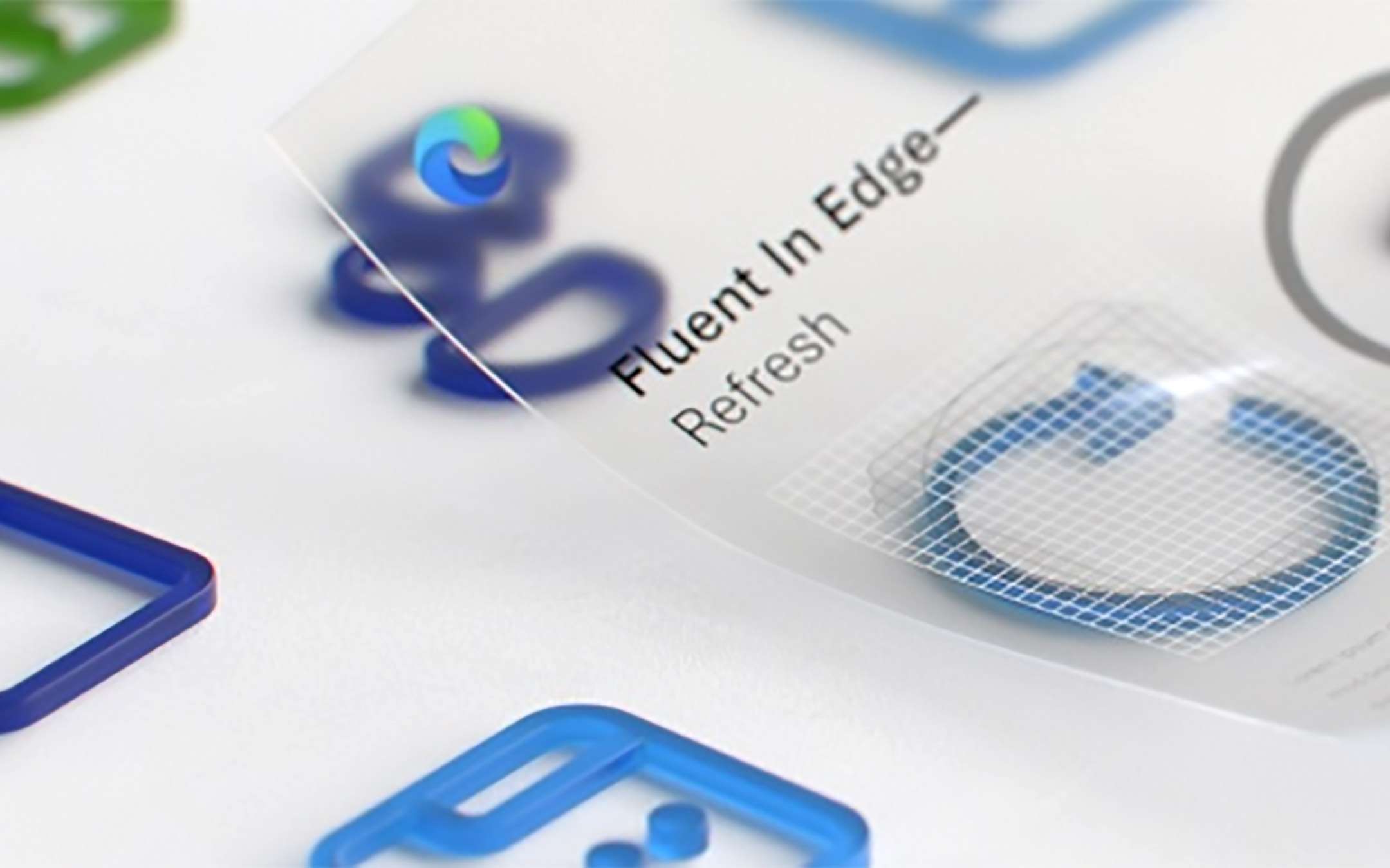
Edge: Fluent Design for browser icons
Nothing revolutionary, but yet another testimony of how the Redmond group is aiming in this direction. The image below shows what has changed, adopting an appearance with a slight three-dimensional effect. In the post announcing the novelty, reference is also made to a new rendering engine to ensure that icons are displayed the same way on all devices.The new Fluent icon system provides functional optimizations to the experience user since each is based on a standard grid. This improves their identification within the menus and during navigation. We have also optimized the rendering on all platforms and devices so that regardless of the device used, the icons appear defined and easy to understand.
Even the icon associated with a new open tab in the browser has been revised as well as that of the magnifying glass in the address bar now mirrored horizontally. The current ones are based on MDL2 (Microsoft Design Language) introduced in 2014.
The guidelines of Fluent Design have already been implemented in other Microsoft products with restyling that have so far affected the Windows 10 operating system, the Office package dedicated to productivity and the Teams service for remote communication.
Source: Microsoft